
Experian: Test Your Credit Knowledge
They sold a game with a score. I built a quiz with none.
Services
Cultural Strategy, Brand Strategy

Role
Associate Creative Director. Redesigned the experience end to end, balancing Experian and Yahoo's visual identities into one consistent system built to keep someone moving through all twelve questions.
Impact
Quiz Completion
Page Views
Avg. Time Spent
71%
167K
57sec
Engagement
10x+ benchmark
25%+ benchmark
Overview
A previous team had already sold Experian on a competitive stacking game — build blocks of financial knowledge, reveal your score. I was brought in after the fact.
No one wakes up wanting to read a white paper on credit algorithms. People want to know: am I going to be okay, can I rent that apartment, can I buy that car. For an audience already anxious about not knowing enough, a score just told them they'd lost.
Strategy
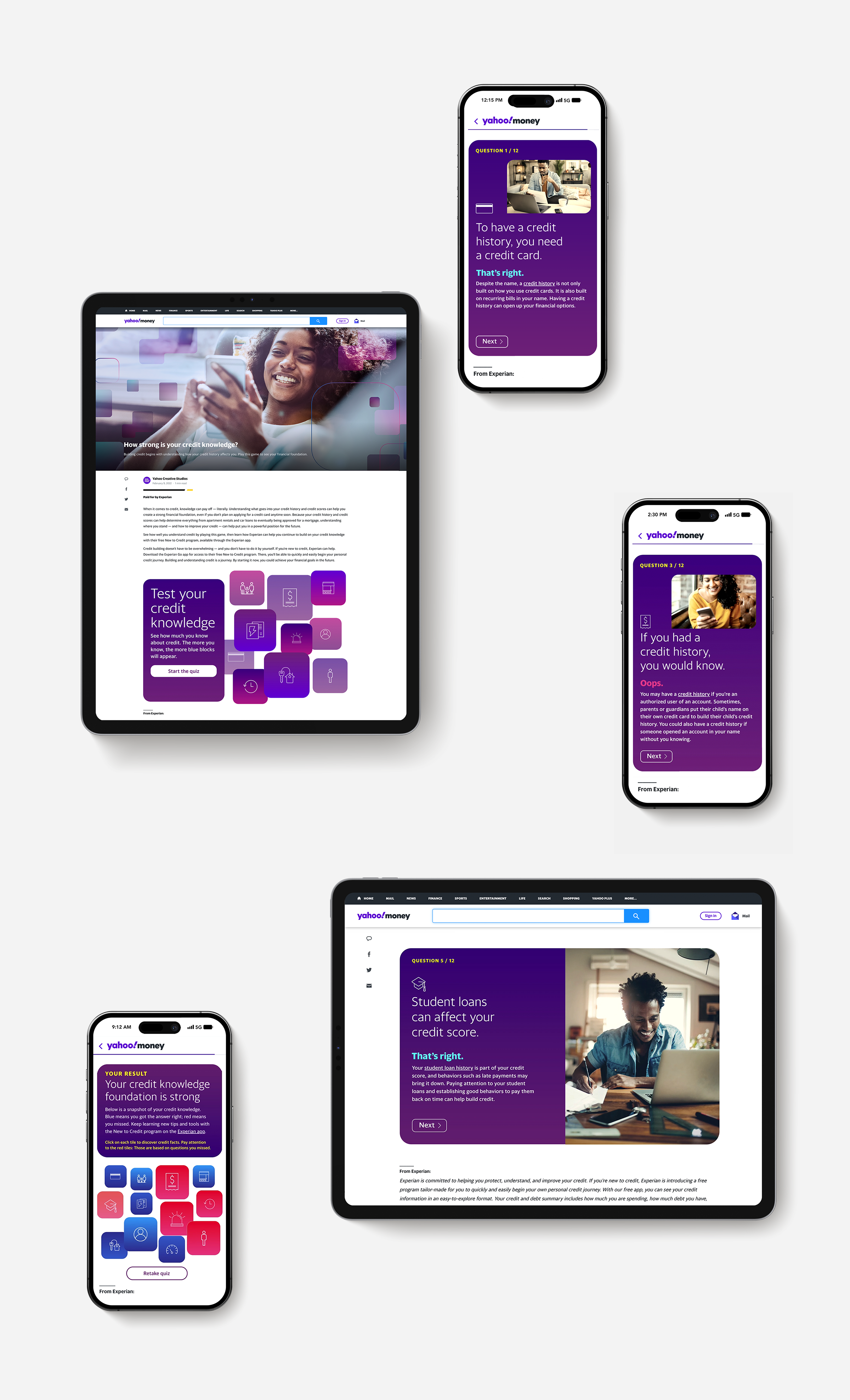
I reframed it as trivia that never tells you if you're winning. Twelve statements about credit, confirmed or corrected one at a time, each followed by the reasoning, not a judgment. Only at the end does everything compile into a single grid: blue for what you knew, red for what's next. No score, no ranking — scoring financial literacy was also a legal grey area a credit company couldn't afford. Every question, right or wrong, left you smarter than it found you.
The Approach
Yahoo gave the frame — standardized typography, clean editorial margins, the signals of a safe, informative read. Experian gave the soul — its deep purple canvas, the tactile squircle geometry pulled straight from its own logo, a tone built to feel empowering, not clinical. That same squircle became the interactive grid itself: knowledge, built piece by piece, in the brand's own shape.
Layout Mechanics
No red X, no running tally — just plain confirmation and a reason why. "Oops" instead of a wrong-answer buzzer treats the user like a capable student, not a delinquent borrower. The result screen doesn't grade you. Purple tiles turn blue as you answer, building your own knowledge grid in real time.

Looking Back
Within real build constraints, I'd have pushed the tone further. A question about student loans doesn't need a stock photo of someone at a laptop — it needs a close-up of someone staring down a cup of instant ramen, a sticker reading "R.I.P. my savings" stuck over it like a joke between friends. Serious information, delivered like something a friend would send you.
Credits
Executive Creative Director
UX Designer
Copy Editor
Brian Lightbody
Brad Mead
Anna Davies